
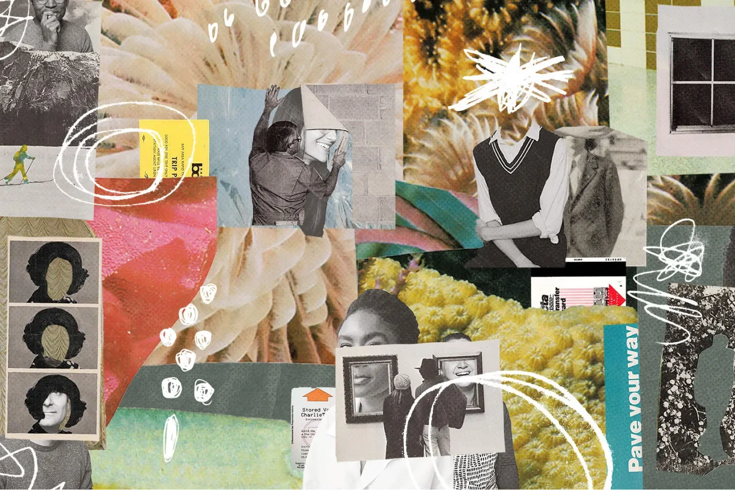
IDEO
At IDEO, I worked at the intersection of production design and brand identity, helping clients translate their values and mission into compelling visual systems. My role focused on bringing brands to life not just digitally, but across print, photography, and physical touch-points, ensuring every detail aligned with a bigger picture of who they are and where they’re headed.
This meant designing how a brand shows up in the real world, on uniforms, vehicles, signage, packaging, and environments. Each application was an opportunity to tell a story, connect with an audience, and create continuity between purpose and presence. The work was deeply collaborative, strategic, and rooted in making brand identity feel lived, not just seen
QUORA
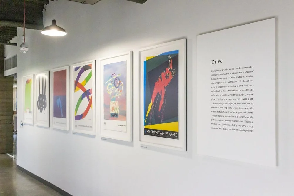
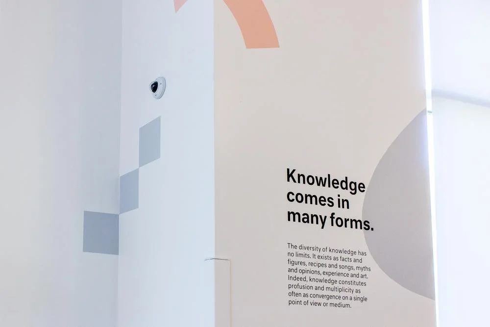
Led the environmental design effort to translate Quora’s mission and values into physical space through architecture, art, and brand storytelling. We redesigned key communal areas with custom fabrications in white oak and powder-coated steel, layered with bold color and type treatments that echoed Quora’s ideas around knowledge dynamics.
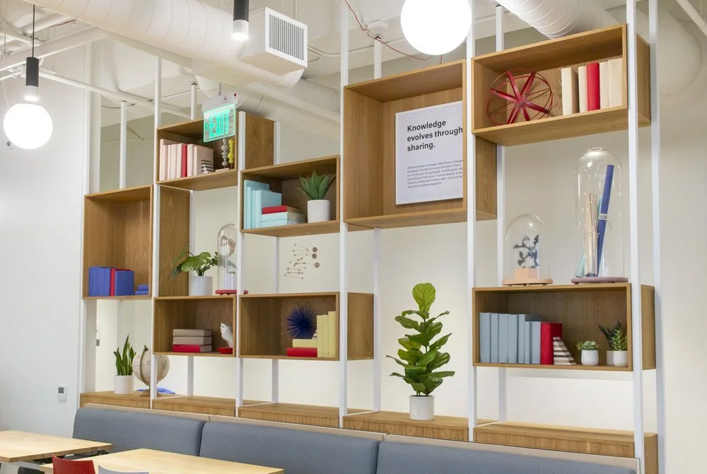
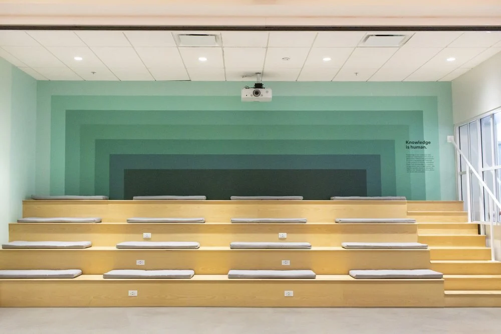
The transformation wasn’t just aesthetic—it increased seating capacity, improved flow, and reinforced Quora’s brand as a tool for connection and clarity. We also curated a series of fine art installations across the HQ, pairing works by artists like Eames and Warhol with interpretive placards that connected each piece to the company’s core values.
A comprehensive rebranding of Mexichem into Orbia. This transformation went beyond a simple name change, signifying a fundamental shift in the company's business strategy and purpose.
ORBIA
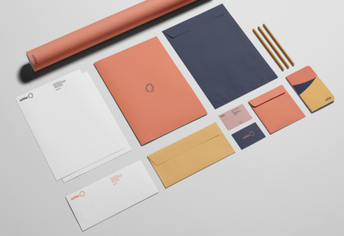
Orbia’s brand identity is not just a logo or a color scheme, but a reflection of its forward thinking values, mission, and vision, creating a memorable impact mark to redefine it’s commitment to a more sustainable future.
This identity is skillfully applied across various platforms and touchpoints from digital marketing campaigns to product packaging.


